I was already in college by the time I learned the
distinction between "illustration" and "art."
Boiled down, illustration communicates an idea, art evokes a feeling.
( Don't quote me~ that's my personal observation.)
For me, the line has always been a bit blurred. And why not?
Here is a case in point;
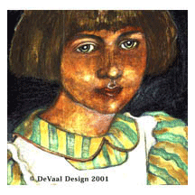
I did the oil painting above as a personal project.
I loved the angle of light on her face and the expression in her eyes.
A few years later, I sold it as an illustration for a short story
about the emotional transition of a young girl becoming a woman.
See? Illustration. Art.
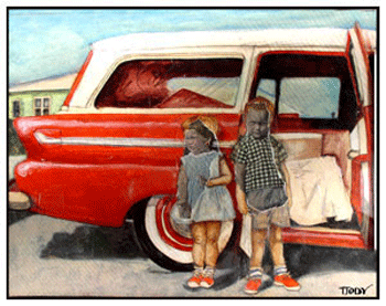
This is also oil, (original 16" by 12")
part of a series looking back on childhood.
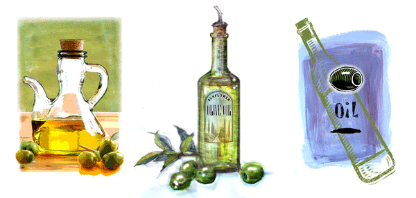
Here is an example of the other extreme.
Client simply wanted to see how I would illustrate olive oil.
I will usually do a range of examples, until I know the client.
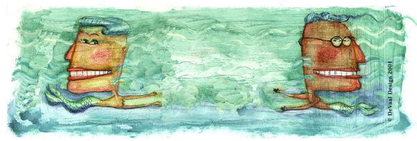
This bit of whimsy was actually done for a fruited water,
a new bottled beverage product for Coca Cola U.K.
which unfortunately, never enjoyed...fruition.
...sorry, bad pun....
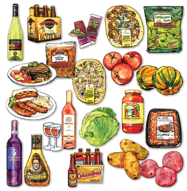
Combining line art and watercolor pencils is how I developed a technique
to illustrate grocery items for a monthly mailer.
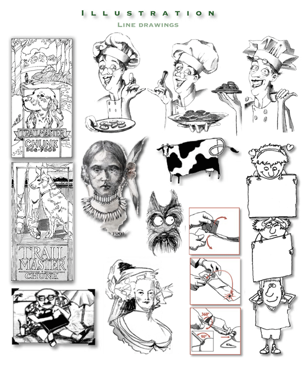
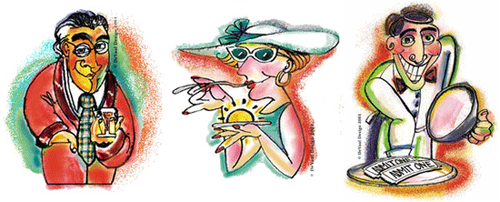
Here is a sampling of simple black and white illustrations
done for various projects.
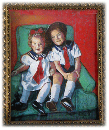
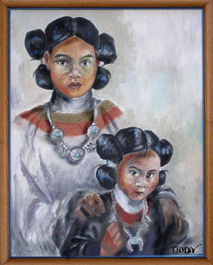
Soft Pastel drawing (22" x 32") of the two most beautiful children in the world.
This series was created for Austin's Steakhouse, Minneapolis, Minnesota.
(Client, Richard Schooley, Intrepid World, Mpls.)
Oil painting, 18" by 24" ( Courtesy of Amy & Robin Huber )
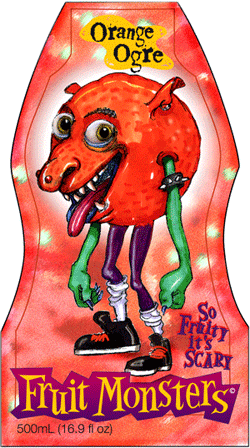
Remember "Jolly-Olly Orange"?
This guy was for a fruit drink packaged for 10-12 year-olds.
( At that age, apparently the "Garbage Pail Kids"
are preferable to those from the Cabbage Patch. )
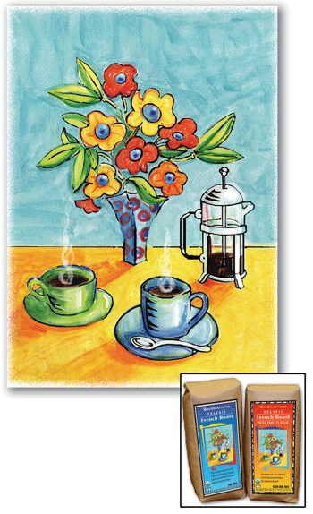
The Sunflower Market coffee packaging allowed me to
use fine art techniques for the nine illustrations.
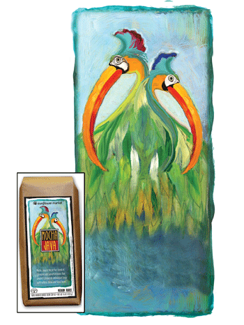
This is oil paint on hot-press illustration board. Original 10" X 13"
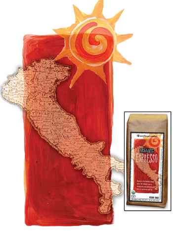
The background art and sun is acrylic on cold-press illustration board.
Italy map was photocopied on vellum and scanned in. Original 8" X 3"
Messy as it is, I like working with soft pastels.
I like the way the texture of the paper shows through. Original 18" X 24"
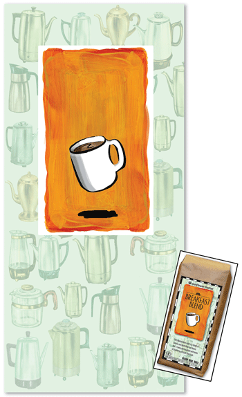
I scanned a page from a 1957 catalog and made this background of purculators.
Orange background is acrylic. Mug is India Ink over gesso and guauche.
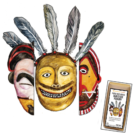
I drew these on vellum, loosely-based on historical ceremonial masks,
then used watercolor pencils. Original 8" x 10"
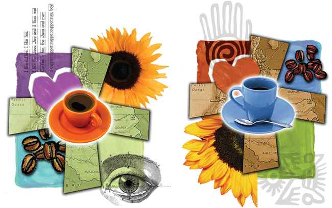
These collages are a combination of acrylics, rubber stamps,
photos, National Geographic maps, and song lyrics.
I can't even remember why I did this one.
But my sister had it framed, and it's hanging on her wall.
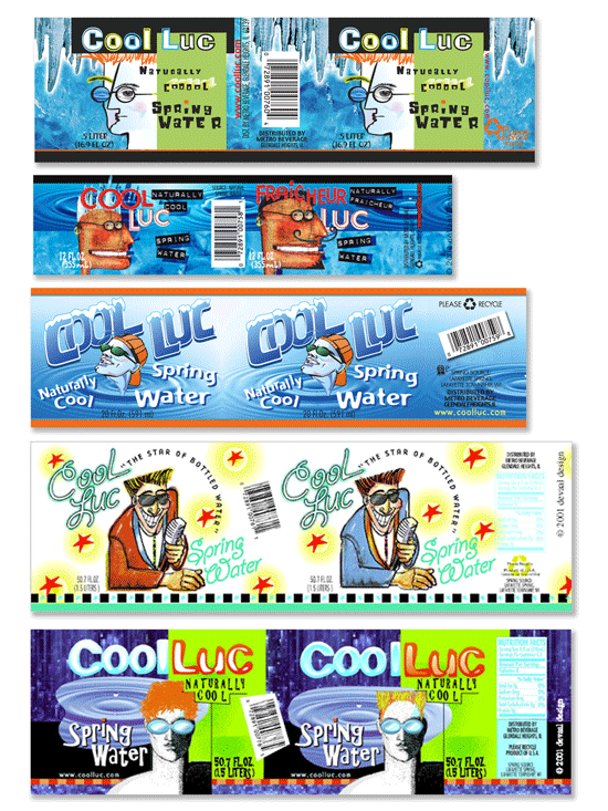
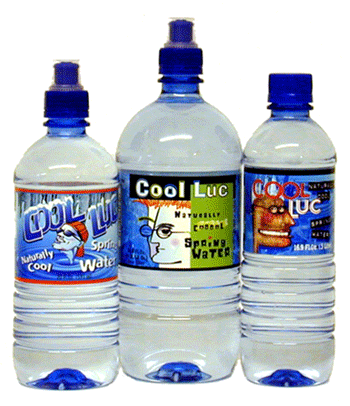
For an Illinois water bottler, I created several characters
for a line called "Cool Luc."
(Each size bottle had a different "Luc.")
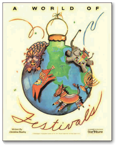
This was done for the cover of a "Newspapers In Education"
classroom supplement. Star-Tribune, Mpls, MN
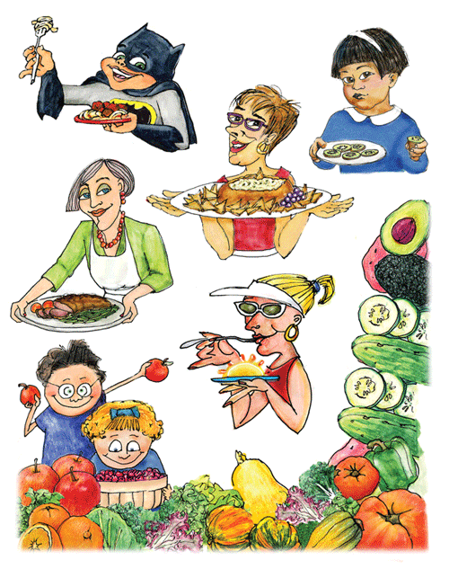
Here is a smattering of illustrations I cranked out for
Sunflower Market's Tasting Panel Report.
This is an old French etching, line art from circa 1914.
It is an image I used in my "Illustration for Non-Illustrators" class.
I enlarged it 300%, painted it with water colors, and framed it.
It seemed a nice way to close this section.
"And that," she said with a smile, "was that."