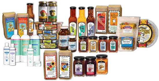
The Sunflower private label program
was my favorite. I have a good background in retail packaging
and I've always loved designing for the consumer.
Because hey- I'm a consumer!
Once I joined the group, the stores began a private label program for Sunflower.
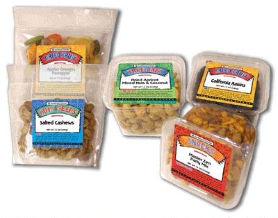
One of the first things I did was design a system for the bulk food category.
One problem with selling in bulk is the freshness factor.
The other is the sanitary issue. (All those bins opening and closing?
And does everyone use the little scoops? Let's not go there...)
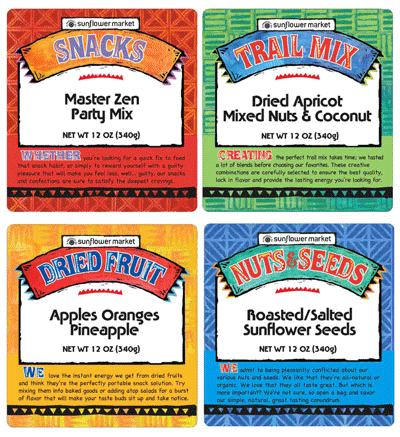
The solution was to package the items in
four categories with assorted bags and tubs;
Snacks, Dried fruit, Nuts & Seeds, and Trail Mixes.
The labels themselves were printed in color and sent to the manufacturer,
who then over-printed the product name etc.
as items were ordered and shipped.
I used scratchboard to create the backgrounds and banners.
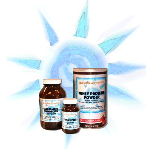
Sunflower found a reliable source for vitamins and supplements
and by putting their own labels on them, saved the consumer $$$
while offering the best quality.
I used soft pastels and a vinegar wash for the image;
the suggestion of a nautilus,
rays of sun and the colors of air and water.
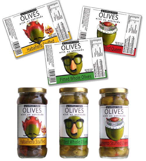
We tasted these fabulous olives, they had amazing character and flavor
but the label on their jar screamed "traditional."
(Yes, a visual can indeed "scream.")
We wanted the label to reflect the contents, so Glenn thought up
"Olives With An Attitude" and the design played off that. Cute, eh?
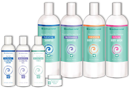
Sunflower Market's Health and Beauty line was a challenge.
The skin care came in small bottles that were silkscreened in a single color,
while the hair care had plastic wraps, using up to four colors.
I chose a gender-neutral green-blue for the family color
and used bright secondary color accents to call out the main attribute.
The swirl and the water lily suggest the gentleness of
these natural pH, perfume & additive-free, cruelty-free creams and lotions.
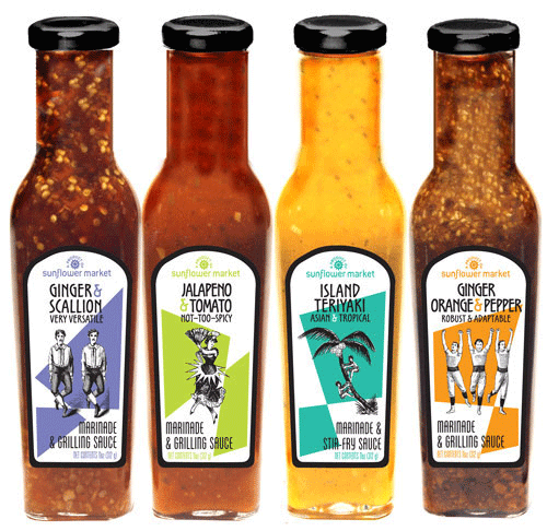
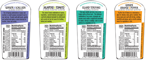
Well-Fed Ed found some absolutely fabulous marinade-stir-fry sauces.
I took an off-beat approach to the 2-color labels; old-fashioned etching art
and bold and colorful geometric shapes that said
"This is not your grandmother's marinade!"
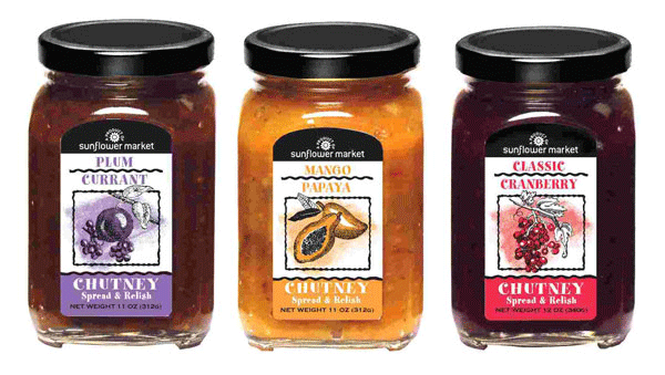
The same company also made outstanding chutneys.
I wanted to somewhat keep a family look, and used etching art and color again
to distinguish between flavors, yet focus on the homemade element of the product.
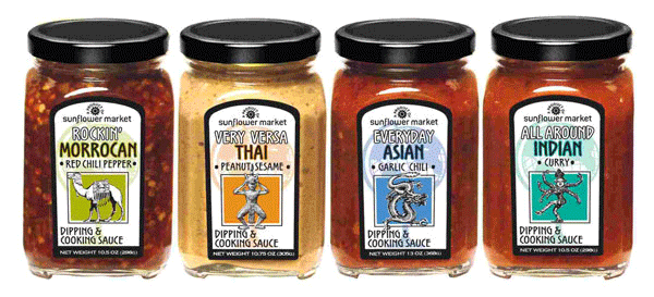
Last in that product line were really uniquely flavored dipping sauces.
They had distinctive world flavors that could be used in everyday cooking,
so we renamed them accordingly. (Again, Glenn came up with the best one:
"Very Versa Thai" peanut sauce.)
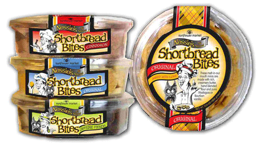
We all fell in love with a line of shortbread cookies.
Seriously, they rocked!
The bakery made bite-sized versions especially for us,
and after a naming session we had "Nessie's Shortbread Bites."
"Nessie" was a good strong Scottish reference,
and a nice tartan was a no-brainer.
I loved drawing Nessie, and posed her differently for each flavor.
(Had a blast with the "Caffeine Fiends" Nessie!)
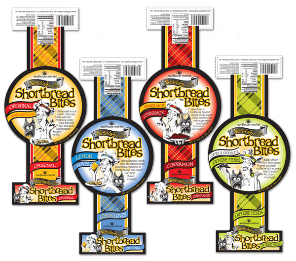
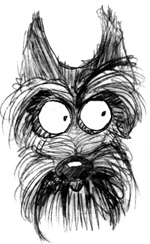
The little Scottie dog is in each panel; his eyes follow the cookies.
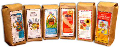
Ahhhhh; The Sunflower Coffee Program.
Ed and Janet, our coffee gurus, found a coffee brewer in California
to create a line of fresh roasted coffee beans for Sunflower Market.
Using illustration techniques I've developed over the years,
I created a special work of art for each coffee flavor,
while using typography and borders to bring them together as a group.
A Dream Project...
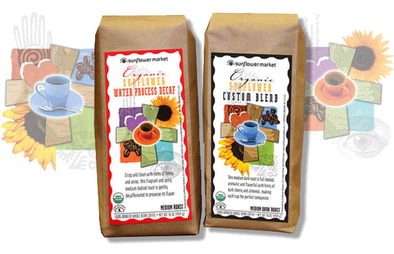
For the Sunflower House Blend, I used cut paper, acrylics,
rubber stamps and photos to make the two collages; regular and decaf.

The Breakfast Blend background (left) is a page from a 1947 housewares catalogue.
The orange is acrylic on cold-press board and I drew the mug in India ink
over opaque gouache, then scanned and layered the three together in Photoshop.)
The "tropical birds" are a species I made up.
(The beaks are awesome but probably not functional)
I painted them in oil on hot-press illustration board.
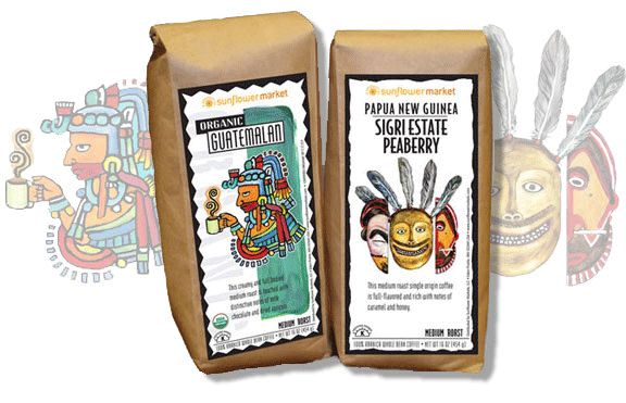
My Aztec (Mayan?) Warrior is loosely based on ancient images
from artifact ruins in Mexico and South America.
(Gotta love the library!) Acrylic.
The New Guinea illustration (right) was drawn from several examples
of tribal ceremonial masks. Graphite line art and watercolor pencils on vellum.
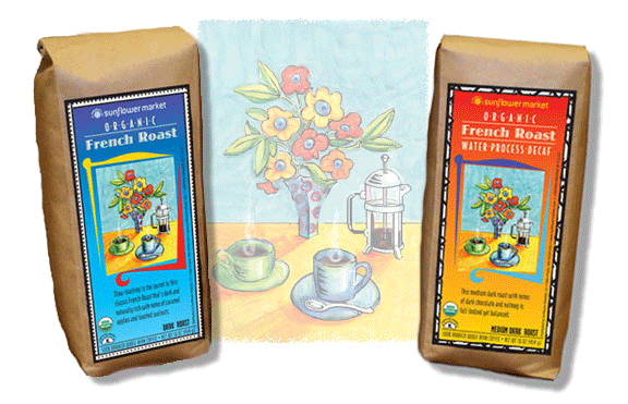
For the French roasts, I imagined a little table for two, fresh flowers
and one of those cool filte-caffe contraptions you see in Paris.
I wanted to see the texture of the paper in the drawing
so I used soft chalk pastels. The colors worked out great;
with the contrasting background colors of the regular and decaf,
the same drawing looks very different on each package.
To see the illustrations themselves,
click link below.
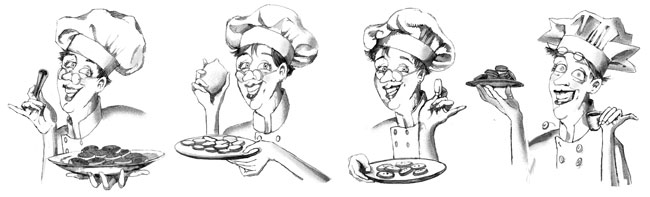
The Sunflower Gang
![]() Sunflower's New Look
Sunflower's New Look
![]() Sunflower Signage
Sunflower Signage
![]() Sunflower Illustrations
Sunflower Illustrations
![]()
HOME