
The first thing that greeted you when you walked in the door
were these colorful six-foot signs.
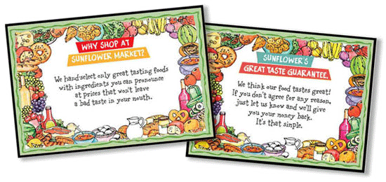
Each one stated the Sunflower philosophy, simply and to the point.
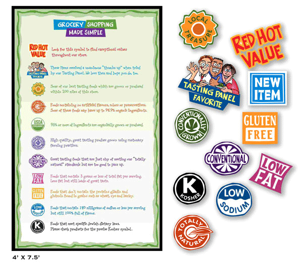
The "Grocery Shopping Made Simple" sign was also prominent at the front of the store.
Each icon was briefly explained.
We let the customers know
that we were reading the "small print" for them.
Not too many attributes, just the most important ones
customers said they looked for when they grocery shopped.
( By the way, I designed all the icons with the exception of the
"USDA Organic" symbol. Most people already recognize that,
but I thought I'd mention it.)
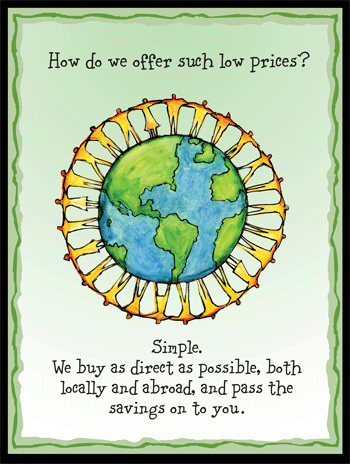
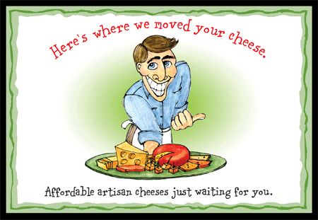
Behind the registers, these three were in full view as you checked out.
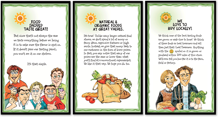
These were sort of the "Big Ideas" behind Sunflower.
In a nutshell, these ideas were what set us apart from
other food stores, and made us special.
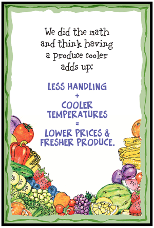
Sunflower had big walk-in produce coolers and we told people why.
Others told customers how we made the choices we did.
Still others simply pointed the way.
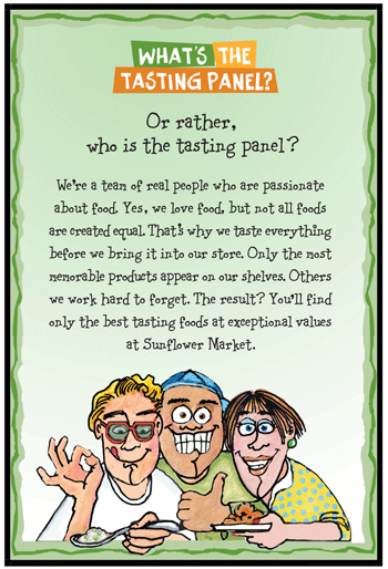
There was a stack of the current Tasting Reports
under a sign that explained how the Tasting Panel worked.
I had a great time with the signs for the wine section.( Who wouldn't? )
I drew this illustration for the Tasting Report, but it was perfect
for the sign, so I redrew it in higher resolution for the "billboard."
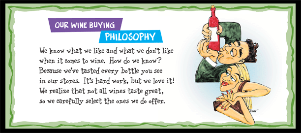
Here's what they looked like in the stores. (Yes, they were very big!)
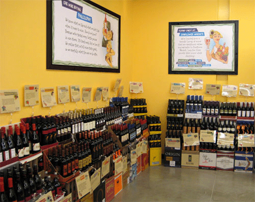
See the other signs in this photo? The ones clipped to the back of the wine cases?
That leads me to the next part of the Sunflower sign system.
(If anyone needs a bathroom break, feel free...)
As I said before, everything in the store had a sign and a story.
And yes, we tasted hundreds of bottles before we chose our inventory.
No wine could cost more than $15.00, but it had to be good.
Our Category Manager in charge of deli, wine, beer and bakery, was Tonya.
She and Jason Kallsen, a local wine afficianado, spent many nights leading us
through the "language of fermented grapes." We got an intense education
and learned the sensual art of wine tasting.
( Did we have great jobs or what?)
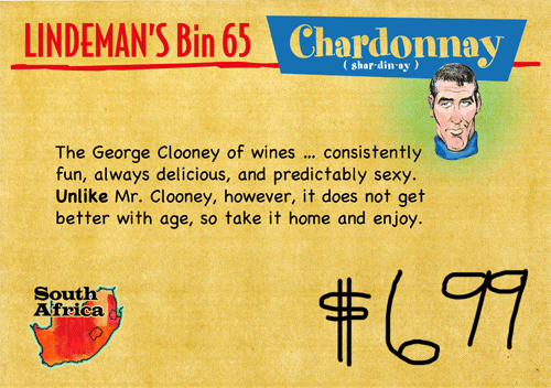
I developed a wine sign template to include the winery, type of grape, country-of-origin
and a place for the store personnel to marker in the price of the wine by hand.
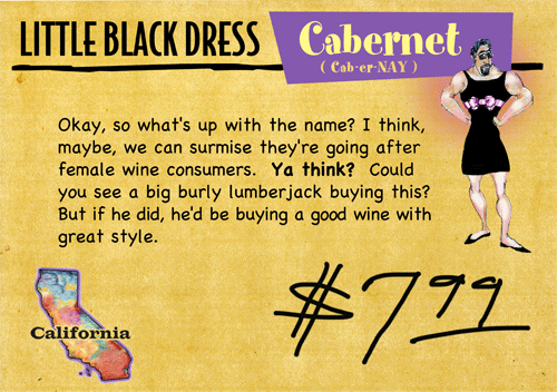
Jasen agreed to write a lot of the copy for the wine signs,
and his stuff was so good I illustrated quite a few before I realized
I'd have to do about 300 before the June Opening.
( I'm fast, but I'm not that fast.)
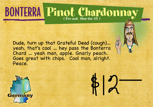
These are just a few.
FYI~Jason has a website, and he's worth checking out for the pure enjoyment
he radiates when he talks "wine." (See links on Home Page)
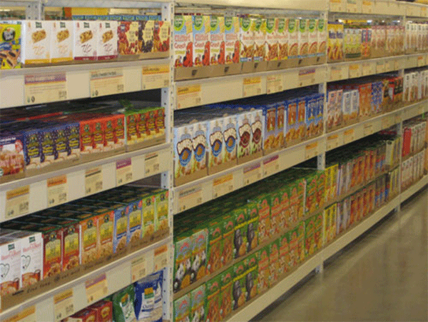
There were over 3000 grocery items that
needed signs in order to meet Dublin's Grand Opening deadline.
( The shelving was specially designed to allow the signs to be attached.)
I developed grocery templates to be accessed online in a central "library"
then printed out at the stores themselves.
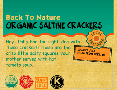
This is a small size, and you can see how the icons worked.
( The Local Treasures info had to be filled in by hand.)
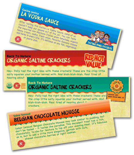
There was a time when it seemed like everyone was writing copy for these.
It was actually nice to take a break from my work and write about food.
Nicole, who was responsible for proofing all copy, sat not far from me.
Every so often, I'd hear her say, "Tjody must have written this one..."
The Sunflower Gang
 Sunflower's New Look
The Sunflower Saga
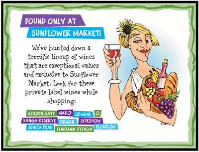
Sunflower's Private Label
Sunflower Illustrations
Sunflower's New Look
The Sunflower Saga
Sunflower's Private Label
Sunflower Illustrations
HOME